This is my first ever toy project using R and basic statistical analysis. I did this before starting my PhD to learn how to use R! I decided to look into something i was interested in; Cricket. I downloaded the data from here using the men’s ODI data set. A little cricket background might also be helpful to the reader, though shouldn’t be necessary, to understand the gist. The long and short of it is each team tries to score as many runs as they can before the other team “gets them out”. This involves one team batting and the other bowling in turn for a certain number of balls.
The impetus to start this analysis was a discussion on Test Match Special (TMS) as to what was the “best” number of wickets to lose in an One Day International Cricket match (ODI), that is the number of batsmen that have been “gotten out”. Anecdotally the team suggested around 5 or 6 wickets, with Andrew Sampson the resident stats man confirming the that the optimum was around 5.5 though no information was given as to how this number was obtained (its also unclear how a team can lose half a wicket, but that’s a different matter). I thought it would be fun to see if I could come up with some meaningful reason why.
To start with I considered both 1st and 2nd innings totals so as to increase sample size, however, they cannot be analysed in the same way since second innings are not played to completion in the event of a successful run chase. I therefore restricted my analysis to first innings scores; where the only objective of the teams is to score as many runs as possible in the allotted 50 overs or 10 wickets. I also restricted to games where there was a result, with no balls lost due to rain delays.
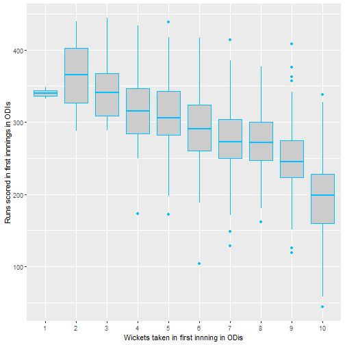
To look at this quickly we used the standard ANOVA framework to verify that there is a significant difference between treatments i.e. number of wickets. First I take a quick look at the sample means just to check that we’re on the right track.
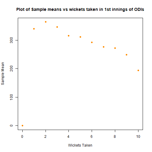
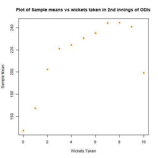
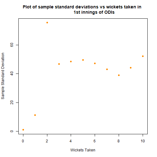
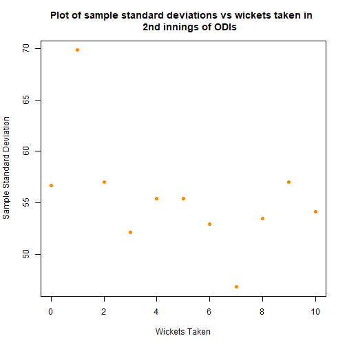
Above the first and second innings graphs are included, in the hope of justifying the exclusion of the second innings scores. The second innings sample means seem to follow a different shape, along with strange hump in the sample standard deviations. This lends weight to the argument to exclude, in addition to the experimental design suggesting that the first innings and second innings scores are fundamentally different.
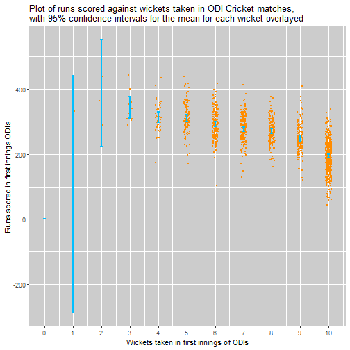
Using the central limit theorem the below plot gives a confidence interval of the means. Again this suggests that there is an effect attributable to the number of wickets taken. If we discount losing 0,1 or 2 wickets - since the variance of scores is very high and the sample size low, it seems that 3 is the number of wickets lost that is associated with the highest scores, this is a little different to the 5.5 wickets suggested by the TMS team.
I would suggest that the the games where only 3 or 4 wickets are lost only make up <5% of all matches, and thus may be games where the pitch is particularly easy to bat on or the bowling team poor. Thus it might be justified that 5 or 6 wickets is a “better” number to lose in most situations.
It seems clear that there is a treatment effect as expected, but it is important to test for this. With the hope of using standard normal theory in the ANOVA framework, I investigated whether for each wicket taken the runs scored follows a normal distribution. I checked the probability plots for each, which were mostly linear suggesting that the standard framework can be used.
Proceeding with standard ANOVA method we can conclude that there is indeed an effect as expected.
##               Df  Sum Sq Mean Sq F value Pr(>F)
## Wickets_1      9 2433848  270428     121 <2e-16 ***
## Residuals   1173 2631746    2244
## ---
## Signif. codes:  0 '***' 0.001 '**' 0.01 '*' 0.05 '.' 0.1 ' ' 1
I also investigated this without assuming normality of the standard errors for each wicket treatment using the Boneferroni test, since we can’t use a simple t test since we need to avoid multiple comparisons. This also yielded a highly significant result for the wicket effect.
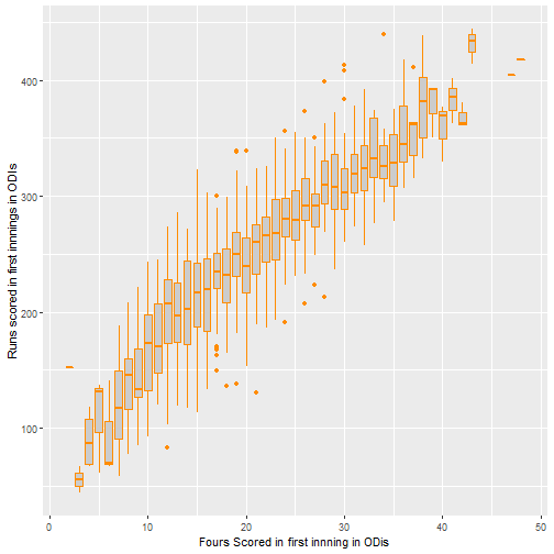
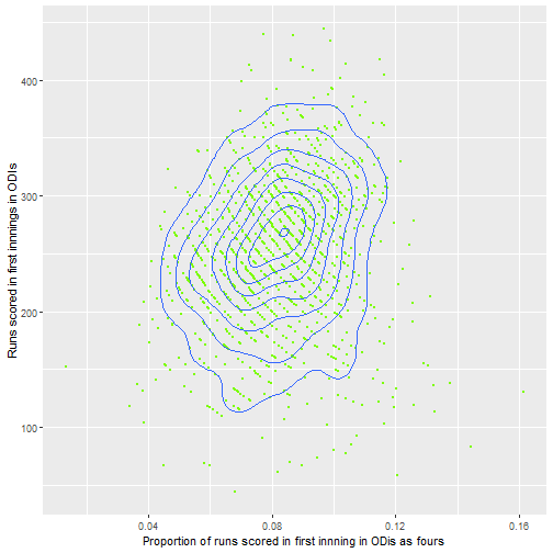
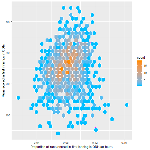
Since this wasn’t all that surprising I thought about possible summary statistics that could be predictive of high first innings scores. Below I plot some graphs as an initial exploratory analysis as to what may be associated with high first innings scores, this was one of the first things I did to practice using the great ggplot2 package in R.
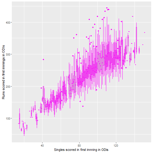
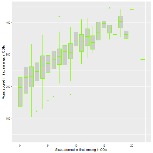 The above plots do not really say that much apart from that if more sixes and fours are scored, the score tends to by higher. Note that there are few data points for losing fewer wickets than 4, so the standard error is higher.
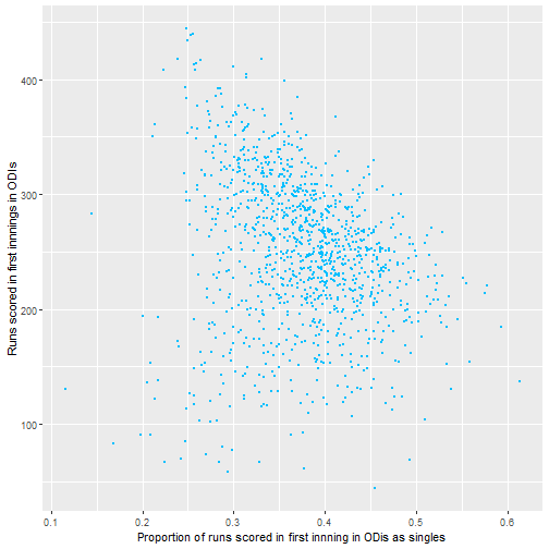
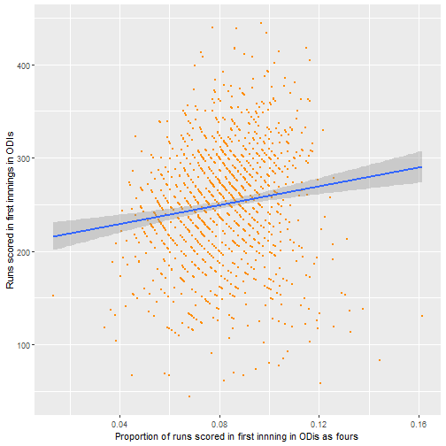
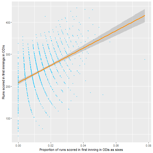
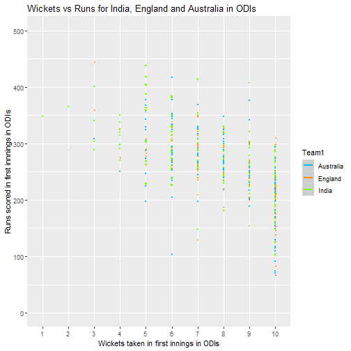
From this it seems like number of sixes seem to be the most promising area to investigate, with the proportion of runs scored as fours or singles seemingly less important. It also seems that the big 3 teams generally are similar though this could be tested formally also.